Remember back in March when we told you that we'd be working on a new website? Well, we're finished! Please give a warm welcome to fidmmuseum.org, our new website. Our goal was to create a visually stunning site which facilitates user-friendly online research into our collections. Within the new site we have made it easier for users to find general information, make donations to the Museum, and learn more about upcoming events and exhibitions. The site is a living document of the FIDM Museum and we plan to make continual upgrades and improvements.
To celebrate the launch of fidmmuseum.org and our current Little Black Dress exhibition, we're giving away one copy of The Black Dress by Valerie Steele. To enter this giveaway, take a look at fidmmuseum.org and let us know what you think. We're interested in your input on the following questions:
Is the site easy to use and navigate?
What content did you find most useful?
Is the site visually appealing?
Any suggestions for improvements or additions to the site.
Leave a comment on this blog post with your reactions to the new website and you'll be entered in The Black Dress book giveaway. The giveaway closes on Wednesday, July 13, 2011 at 5 p.m. PST. One winner will be selected by random number generator from all comments. As we make changes and improvements to our website, all of your comments will be taken into consideration. We value your input, so let us know what you think!
And don't forget to visit our current exhibition, LBD (Little Black Dress): An Homage to Breakfast at Tiffany’s through August 13, 2011.
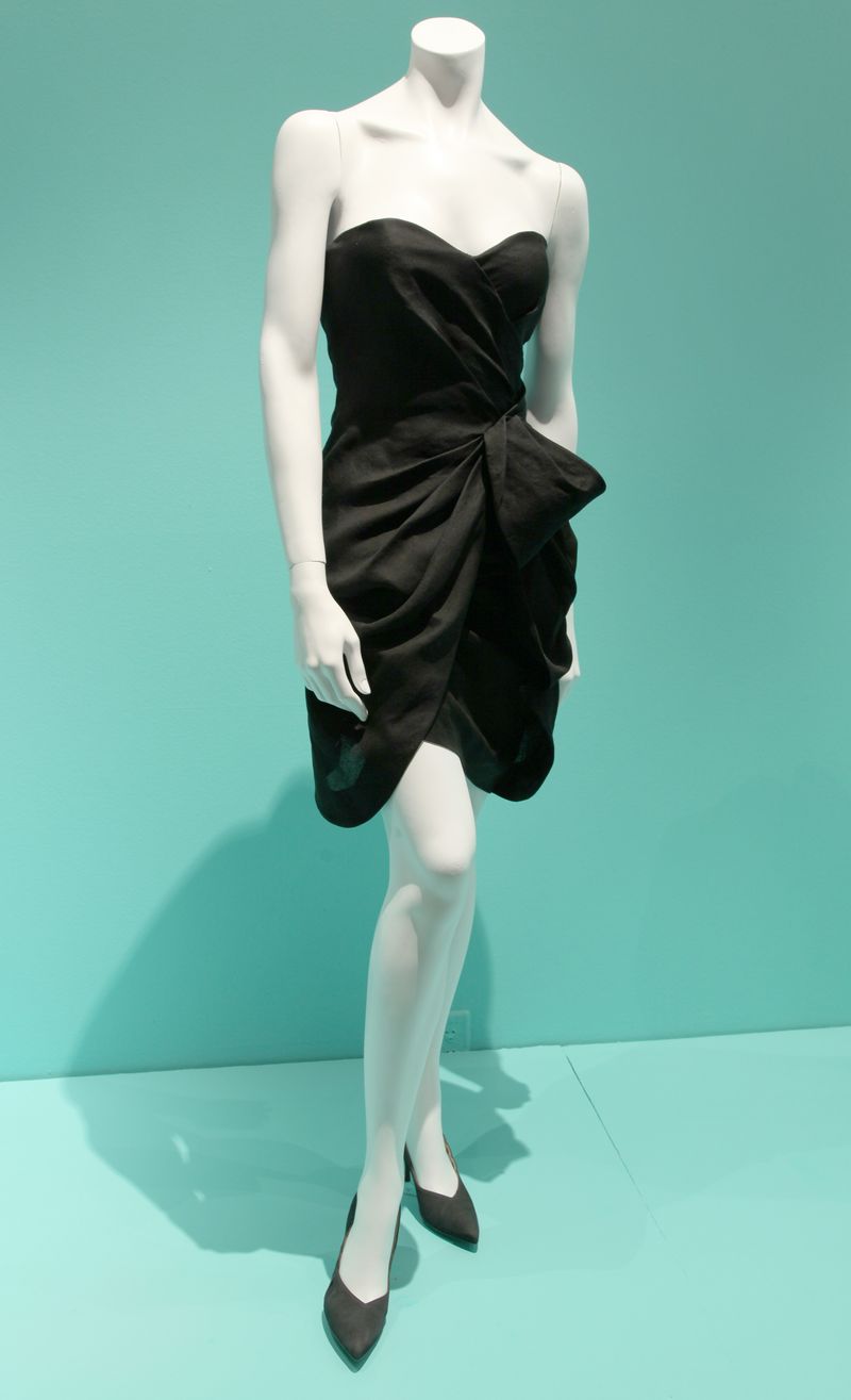
 Monique Lhuillier (FIDM Alum), Resort 2010 washed organdy cocktail dress worn by Mila Kunis. Courtesy of Monique Lhuillier
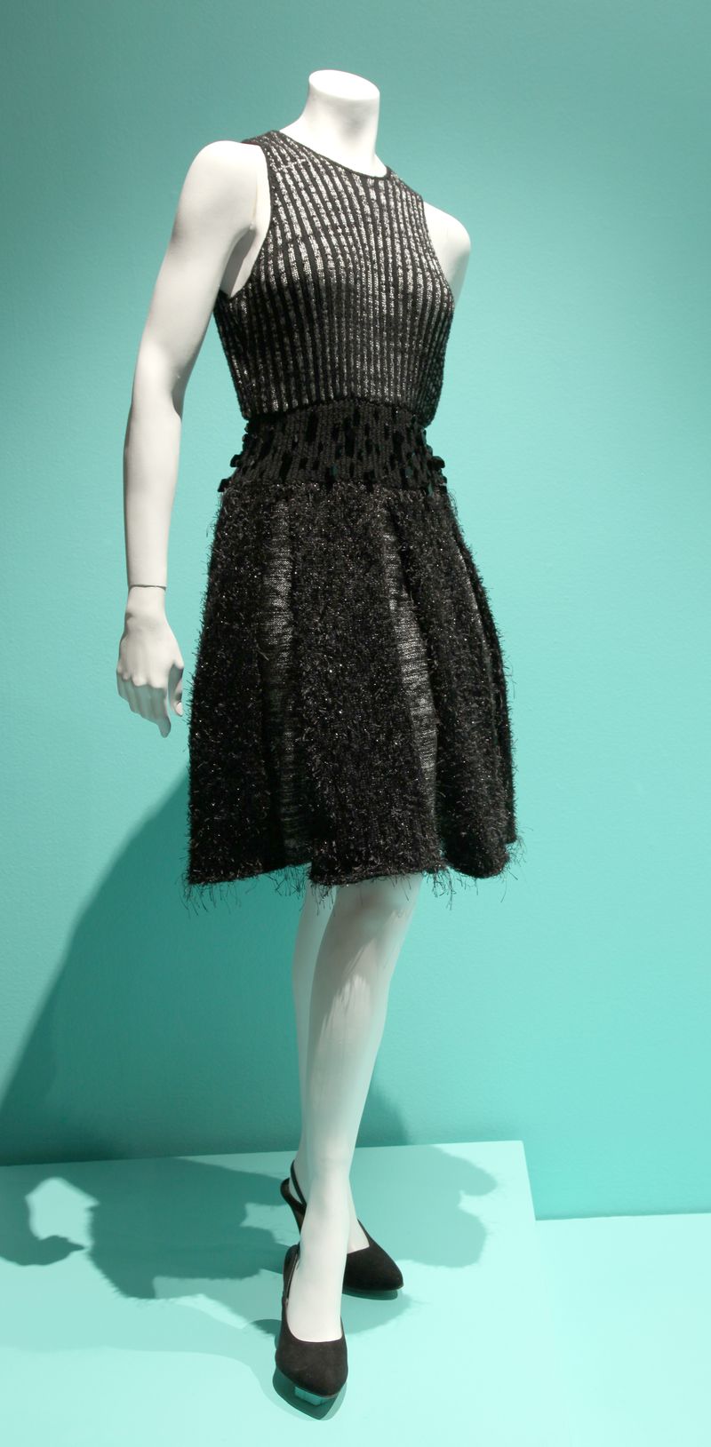
 Adelle Burda (Recent FIDM Alum) Knitted dress adorned with black Swarovski crystals.


Love the new website/blog! It is very easy to find info. Especially with the categories alphabatized. Subcategories could help decrease the volume of how many tabs are already there. Wish I could see the Little Black Dress exhibit in person, they look amazing!!
Though I think the site is easy enough to use and navigate, the different “textures” and visual accents make the site seem busier and feel more cluttered than it really is. This has nothing to do with the site, but I wish I lived closer and could see these cool, free exhibitions you’re hosting. Hope this helps. 🙂
Me, me! I want to WIN! But I think I can’t. 🙁
The website looks great but I agree with the comment by Celine, it needs subcategories. 16 pages of thumbnails under womenswear is a bit cumbersome.
However, I love, love, love that you have an easy to find and clear setup for donations and endowments!
I think the photos are visually appealing (just like they are on this blog), the background less so, as Antoinette pointed out… it seems a bit cluttered and difficult to “filter out”. I think it’s because – at least on my computer screen – the background is yellowish, almost greenish brown, while the banner and other accents are reddish brown and red – they clash, subtly, but they do.
I also agree that subcategories in the collections would be useful – or a possibility of advanced search, e.g. by decades, to see only the things you want to see. The Google search seems a bit limited in that respect… Other than that, though, the site seems very easy and intuitive to navigate to me. I always know where I am and where I can go from there, and there’s a clear, simple, constant pattern to the in-site links (I hope this makes sense). And I like that there’s a link to the blog.
Because I’m far away from the USA and a visit to Los Angeles is highly unlikely, I find the online collections most useful. But from a quick look, it seems the pages dedicated to visitors are very neat and user friendly, too.
So, all in all, a good job! And thank you for maintaining this blog – it’s great to get a a chance to learn more about the background of museum pieces – and research.
I agree with some of the suggestions posted above. The colors are great but I would make the font bolder. The pictures look great and I found it easy to navigate. I love all the categories, makes it easier to find what you’re looking for. I saw the exhibit and LOVED it!! Couldn’t take my eyes of the Dior, Givenchy, and Chanel LBDs!!!
I’m excited about the FIDMMuseum new wedpage. My daughter is a brand new fashion design student at the San Francisco campus and I think this site is going to be so useful to her. I’ve enjoyed reading several blogs and can’t wait to read more. So much information!
Congrats on the new website! It is very pretty and it is easy to use. I love the option of going to ‘collections’ and seeing what kind of beauties there are in the FIDM collection.
What I would love to see improved, would be the possibility of clicking on information left, to see what similar designer, time, style or what so ever there are in the collection. Also if there are stories written on the FIDM blog about the object, a link would be amazing.
Love the new website. Layout and menu are logical and easy to use, plenty of information.
Complaint: when viewing the thumbnails, if I click on one, then go back to the thumbnails, it takes me to the BEGINNING, not to where I left off. Also, I have to re-set my preference for how many thumbnails per page. Wish it would remember where I was, and what preference I selected.
Or is this a problem at my end, perhaps with my cookie settings?
Love to win the book.
The site was easy to use and navigate. I loved looking at the ephemera collections. It seems to be visually appealing.
I wish there was more information accompanying the collection pieces though. Perhaps links to some of the blog articles about the pieces would good.
I do like the new website, it is easily navigable and the images are vibrant and exciting. I would love to see more information on each item. It is one of my frustrations with many costume and textile websites. The exhibition information is very useful (I’m already planning my next visit this Fall when I am back in LA).
I find sites that have photographs or really anything that moves in a way that I cannot control to be extremely distracting. I enjoyed seeing the items displayed in your revolving display, but I would prefer to scroll through them myself. As it is now, I found it difficult to read the further content on the page. I have come to enjoy your blog very much since I am completely and utterly fascinated with dress and its accoutrements. Thank you.
The new site is visually appealing, but when looking at the collection I was frustrated by the lack of ability to search by type. The general category of “womenswear” is too broad, I had to wade through too much to see the items I was most interested in. I’d like to see a search function that would allow me to find specific articles of clothing. If there is already a way to do that, it wasn’t obvious to me and I missed it, which is a problem, in and of itself. That suggests to me that it may not be user friendly. I look forward to being able to turn to your site as a research tool once it’s easier to search. Thanks for all the effort to make this available to us!
Nicely done! I like the scrolling photos on the home page that give lots of wonderful eye candy. I do agree that the collections pages need work. I’d like to see the designer’s name in the pop up title please. And YES, when I’m on page 4, click in to view a particular item, then click my back button, it takes me back to page 1. Frustrating. I’d love to see more photos on the Past Exhibitions pages. I live on the East Coast and am not able to visit your museum, but would love to do so virtually.
Personally I like the page and layout. I agree with the comment above that since I can’t visit you in person, I’d love more of a virtual tour of collections past
My first reaction was one of delight. Visually the site really pulls you in. I immediately was drawn to the research tab right away, because that is what I use your collections for the most. The thumbnails are great, but I am interested in specific eras so wading through 16+ pages of womenswear pictures does not appeal to me very much. A search for 1920s only brought me to one exhibit and I am pretty sure you have more than a few things from the 20s.
It would also be helpful to have linked tags so you can find other similar items.
The layout is beautiful (love the large images), but I do wish it were a little more research friendly. More categories would help – especially the Hollywood collection (and maybe by decade?). Thanks for the opportunity to provide feedback!
I absolutely love the new site! The colorful photos on the homepage make it visually appealing, and encourage a web visitor to explore the site more. One thing that I found extremely exciting is the freedom to browse through some of the collections, which are helpfully divided into subcategories. I agree with some of the other users that it would be nice if there were a search option, but the ability to see some of your collections online is amazing, especially since I live across the country and can’t make it to any of the exhibitions.
One thing I would consider adding is a more prominent link to the blog on the homepage, especially since the blog gives more detailed information on specific pieces, looks, or time periods. This will also help with those curious enough to want more information, plus may pull in more followers (I did notice the Curator’s Corner,and while a great idea for it to have it’s own subheading,I feel that it may be skipped-perhaps add a link on the Collections page?)
Otherwise, I think it’s a well laid out, visually attractive site that is sure to draw in visitors!
I will definitely have my students use this website. I especially like the slide show option.
I think the pictures are very visually appealling, the site was very easy to navigate around on. My favorite part is the 9 picture slideshow on the home page!
Is the site easy to use and navigate?
Yes! very! I love the tabs at the top.
What content did you find most useful?
pictures of the collection, because I live far away. If I were ever in LA, the visitation info seems very useful.
Is the site visually appealing?
very nice, clean aesthetic. The best part are the excellent photos of the collection.
Any suggestions for improvements or additions to the site.
Collections images need to be searchable! Also, when I did I site search I was very thrown by it sending me to a google page.
I think the new site is great and very easy to use. Unfortunately I won’t be visitng your fabulous museum any time soon because I live far, far away on another side of the planet. However, I really enjoy your blog and the photographs of your collection on your webpage. It would be great if your collection was searchable or could be sorted in some way for viewing, e.g. by decade. If I click on women’s wear, for example, it would be great if I could only look at the pieces you have from one particular era. Love your site.
The new site is very visually appealing, easy to navigate, and find information. The one thing I couldn’t find was information about the beautiful Helen Larson collection, but I might not have looked in the right spot.
The visitor information was easy to find and useful, especially in regard to parking.
Could you add an easy way to get from it to the FIDM Museum Store site?
I really like the gallery view with the date that pops when the cursor moves over it. Very clean looking and easy to look through. It might be nice to sort the gallery as a time line to see the evolution of fashion.